

Today I am going to teach you how to build a dashboard, by going over the major steps that are required for building a dashboard in Google Sheets.
The video / article will help you gain a fundamental understanding for how dashboards are built, and will also serve as an overview to the full tutorial where I teach you how to build the dashboard in detail, step by step. In this overview, you will see the dashboard being built in the background, in fast motion, as I teach the overall concepts that are being applied.
You can find the full tutorial for the basic sales dashboard here
You can view the entire dashboards course here
Get your free Google Sheets formulas cheat sheet
Watch the video below to see the concepts that I am talking about, being applied while I build a sales dashboard.
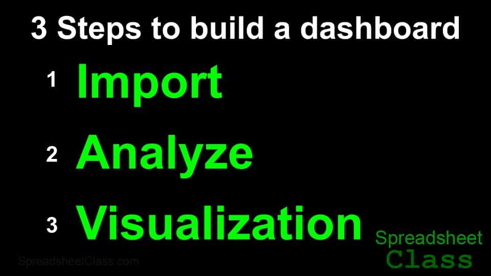
The 3 major steps for building a Google Sheets dashboard
But again today I am going to teach you a process that you can follow when building any dashboard, which consists of 3 major steps.
These 3 steps that are required for building a dashboard with raw data, are:
- Importing your data
- Analyzing it or parsing it
- Displaying the data visually
These are the steps that I have followed for the past 7 years when I create dashboards for online schools and other companies.
So as you watch me building the dashboard in fast motion, don’t worry about every little step because that’s what the full tutorial is for. In that video I will go over every formula and every method in great detail. But here I am simply focusing on the general concepts that I’m teaching, and watch them being applied as the dashboard is built.
Step 1: Importing the data into your Google spreadsheet
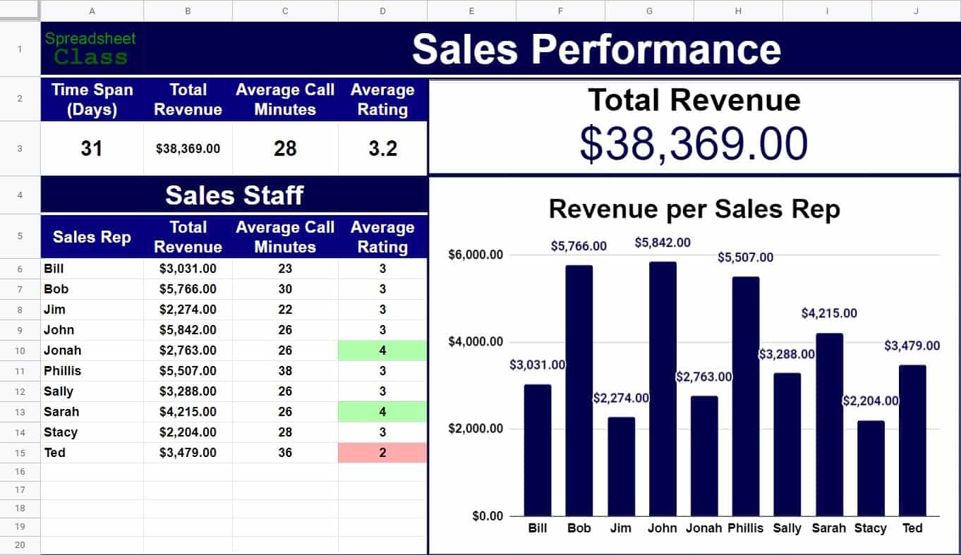
So first, we need to import our data into Google Sheets. In this case we are using a report that shows revenue earned on sales calls.
Google Sheets has an easy option for importing spreadsheet data, or you can also copy and paste your data. I like to store the raw data on it’s own tab, where the tab is labeled something like import, or raw data… to keep the sheet organized. After the dashboard is built, you can overwrite the raw data to update the dashboard, without having to build a new dashboard each time you have new data.
Step 2: Analyzing & staging your data
The next step is to analyze your data, and to stage it… or in other words to put it in a format that is ready to connect to your charts. So what I am doing next formatting my dashboard tab so that the charts have a background that makes them stand out, and also to make a spot to display some of the analyzed data.
I usually prefer to get the dashboard functionality in place before spending a lot of time polishing the colors etc., but to make things easier to see in these videos we spend some time on formatting, before analyzing our data, so that things are very organized and easy to read.
So again the second major step is to analyze our data, and to put it into a format that we can use for charts. What I am doing now is using formulas to make a variety of calculations based on the raw data that I imported… so that I can find the total revenue earned for the entire company, as well as for each sales representative… and other calculations as well such as the average satisfaction rating.
I am analyzing the data, and staging it at the same time. In this case staging means to prepare the data for connection with charts, which I will add soon. For this dashboard I chose to stage my data on the same tab that my charts will go on (The dashboard tab), because I want others to be able to view the calculated totals in a table, in addition to the charts… but you can also choose to put your calculated totals on a separate tab… and you can choose whether or not you want people to view that tab. If you analyze and stage your data on a separate tab, you can hide the tab and still have charts that pull data from it.
Step 3: Data visualization
The final step in building a dashboard, is to create data visuals, such as charts. It’s good practice to create a new tab in your Google spreadsheet, that you can use to display any charts or data visuals that you want. So next I am creating a scorecard chart to display the total revenue at the top, and then I am using a column chart to display the total revenue earned for each sales representative. You can also use other visuals such as conditional formatting, or even sparklines… which I teach in another dashboard video.
So we started with plain, raw data, and we turned it into a professional dashboard that makes the data easy to understand, and that makes people’s jobs easier.
So remember the 3 major steps for creating any dashboard. Import the data, analyze the data, and then display it visually.
If you want to learn how to create this dashboard in detail, check out the lessons linked at the top, as well as the other lessons in my dashboards course.
This content was originally created by Corey Bustos / SpreadsheetClass.com