

Click here to go back to the main dashboards course page.
Download the raw data to follow along: Revenue Report CSV
See the completed sales dashboard: Sales Dashboard
After downloading the raw data that is linked above, scroll down and begin the video (or return to YouTube) to start building the dashboard.
One of the most amazing and valuable things that can be done with Google Sheets, is creating a dashboard.
A lot of people don’t know that Google Sheets can be used to create professional dashboards, and so a lot of companies end up spending way more money and time than they need to on dashboards, when they could have just used Google Sheets.
Well today I am going to teach you how to analyze data, and build beautiful dashboards in Google Sheets (Video is below)! You will not need any special add-ons or apps, just a Google spreadsheet.
I am going to teach you the overall concept of how dashboards work, as well as many important tips that you can apply to analyze data and build Google spreadsheet dashboards.
Then, I will lead you step by step through a complete Google Sheets dashboards tutorial. With the video below, you can follow along with me and actually build a dashboard from start to finish.
The dashboards tutorial video below is for when you are ready to follow along with me and build your first dashboard.
A note on date formats in varying countries
If you are located in Europe or outside of the U.S., your date format will be different than the United States, and this may affect the creation of some of the dashboards. You can change the date format by clicking File > Settings > General > Locale > United States
If you like this dashboards lesson, check out my full dashboards course
Want to have a custom spreadsheet built for your business? Click the button below to learn how I can bring your project to life and save your business time.
What is a dashboard?
A dashboard is a place where data is displayed in a very organized and meaningful way, so that the data can be easily understood by anyone who is viewing that dashboard.
Dashboards usually contain charts / graphs that help people to easily understand the data and what it represents, but data in a dashboard can also be displayed within a table. Dashboards also utilize color formatting to make different types of data easy to identify.
For example, many online schools use dashboards to display the attendance trends of students. An online course provider will export very plain attendance data that is difficult to read in its raw form, but with Google Sheets you can take the raw data and turn it into a dashboard or report that is easy to read.
How dashboards help companies
Companies all around the world, both big and small, are using Google Sheets to analyze their data, and to build their dashboards.
Companies track online sales, attendance, real estate, inventory, and many more types of data, all with Google spreadsheets.
Dashboards can be used to do all of the following, and more:
- Tracking the performance of employees, or students
- Identifying high / low performing products and services
- Show trends in sales, or attendance
- Display the overall performance of an entire company
- Track the progress of courses and projects
There are so many more ways that businesses use dashboards to help them stay strong, organized, and moving forward.
I have personally been building spreadsheet dashboards for companies and business owners for over 5 years now, and am always astonished at how Google Sheets is capable of performing every task that I need it to do for my work.
How to build a Google Sheets dashboard

Okay so now that you know what dashboards are and why they are so important, let’s start going over how to actually build them.
To build a dashboard in Google Sheets, follow these 3 main steps:
- Import your data into a Google spreadsheet
- Parse the data and perform calculations / data analysis by using Google Sheets functions
- Display the data with visualization tools such as charts and graphs
These 3 components are required for every dashboard project:
- Data storage / importing
- Data parsing & data analysis
- Data visualizations
Let’s go over these 3 steps in a little more detail below, and then I will give you a detailed lesson on how to perform each step of the process.
1) The first step is to import your data into the spreadsheet so that it is ready to work with. This step can be as simple as designating a specific spreadsheet tab for your raw data, and then importing the data so that you can start working with it and building your dashboard.
2) Then, the next step is to parse your data, or in other words to organize the data into the format that you want it to be in… so that the data is clean, easy to read, and ready to connect to any needed charts. Performing data analysis such as using formulas to find totals and averages, is also a part of this second step.
3) Then, after you have organized and calculated your data, the final step is to visualize it, or in other words to put it into a format that is easy to read, such as with charts and graphs, conditional formatting, or sparklines.
Below I will give you tips on how to handle each of these steps.
But remember that if you want to actually build a dashboard to get hands on experience, you can follow along with the video at the top of the page and build a sales dashboard.
Step 1: Data Storage / Importing
The first and easiest step of the dashboard creation process, is importing your data into Google Sheets.
In some cases you might create a dashboard that does not run off of a data report, but instead requires manual data entry… but this type of dashboard is more often referred to as a “tracker”.
But most dashboards are built based on pre-existing data that is exported / generated by some type of system, such as a sales platform or an online education platform.
The reason that dashboards are needed in the first place, is that this data is usually very plain and often very “messy”, and hard to interpret by looking at directly. This is where Google Sheets comes to the rescue!
So once you have your raw data (usually in the form of a CSV file), it’s time to import it into a spreadsheet.
Here I will go over how to do this briefly, but you can also click here to learn more about how to import CSV data in Google Sheets, or you can simply follow the first step in the video at the top of this article to actually practice importing data.
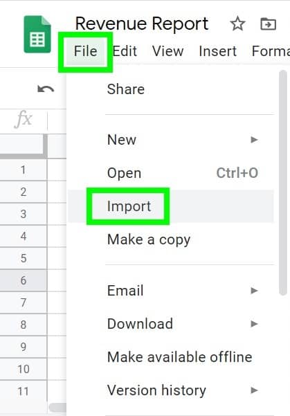
To import your CSV data into your Google spreadsheet, do the following:
- Click “File” on the top toolbar, then click “Import”.
- Click “Upload”, and then click “Select a file from your device”
- Choose the file that you want to import
- Choose your preference for the import location, and then click “Import Data”
Step 2: Data parsing & Analyzation
After your data is stored in a Google spreadsheet, the next step in the dashboard building process is to organize and analyze your data.
By using Google Sheets formulas you can transform your data into a clean format that is easy to read and understand, and that is ready to connect to charts.
This step of the dashboard creation process requires a little bit more knowledge and skill than the other two steps, but is still overall an easy skill to learn.
You don’t need a programming degree or even programming skills to analyze data in Google Sheets, you simply need to learn the correct spreadsheet formulas.
For example, you can use the SUMIF function to sum the values in a specified column of your spreadsheet, where only the rows that meet a specified criteria are summed.
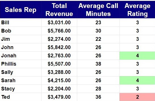
In the example image below, the SUMIF function is used to sum the total revenue for the sales representative “Bill”. Or in other words, the SUMIF function is being used to sum the revenue column, but only the rows that contain the name Bill are being summed.
The formula below can be read like this, “Sum column C from the Import tab, where the value that is in cell A6, is found in column E of the Import tab.”
=SUMIF(Import!C:C, A6, Import!E:E)
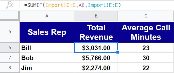
Notice that the text “Import!” appears before the references to columns C and E in this formula, which indicates that we are referring to data that is held on the “Import” tab. This is because the raw data for the dashboard is being stored on a completely different tab, which is good practice and makes the building process clean / easy.
When you are referencing data from another tab in a formula, you must include the name of the tab followed by an exclamation point, before typing the cell range.
The formulas that I use the most when building dashboards, are the following formulas:
FILTER– Filter the rows from a specified data range, where the specified criteria is met
SORT– Sort the specified range, by the specified column, in either ascending order or descending order
UNIQUE– Remove duplicate rows from a specified range
SUM– Add up / sum all of the values in a specified column
SUMIF– Sum a specified column, where a specified criteria in a specified column is met
SUMIFS– Same as SUMIF but contains multiple conditions
COUNTIF– Count the number of times that a specified criteria is met, in a specified column
COUNTIFS– Same as COUNTIF but contains multiple conditions
AVERAGE– Gives the average of a specified column
I will show you how to use all of these formulas and many more in my full Google Sheets dashboards course.
Step 3: Data visualization
The final step of building a dashboard is to display your data with charts, or other helpful visuals such as conditional formatting, or sparklines.
Charts
Google Sheets has a wide variety of charts that you can choose from, which will allow you to display your data in almost any way that you want. The charts can be completely customized to match any color or style that you need as well.
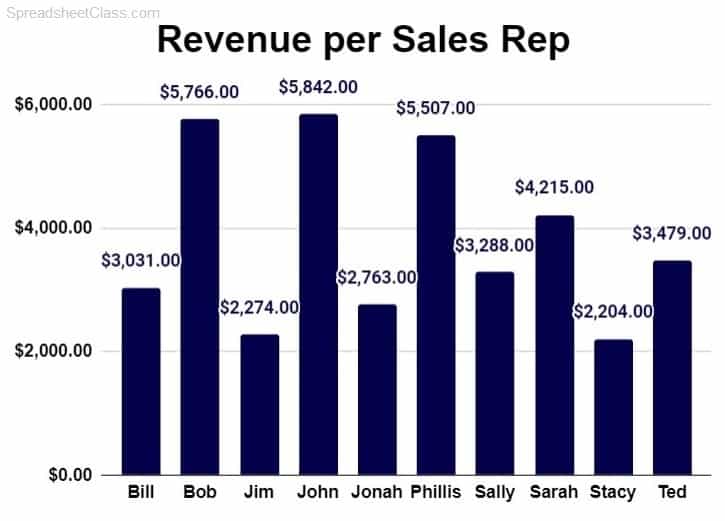
The example above shows a column chart that displays the total revenue earned for a series of sales representatives.
Google Sheets also has line charts, bar charts, pie charts, and many more charts / graphs.
I will show you how to insert a chart below, but click here if you want to learn more about how to use and customize charts in Google Sheets.
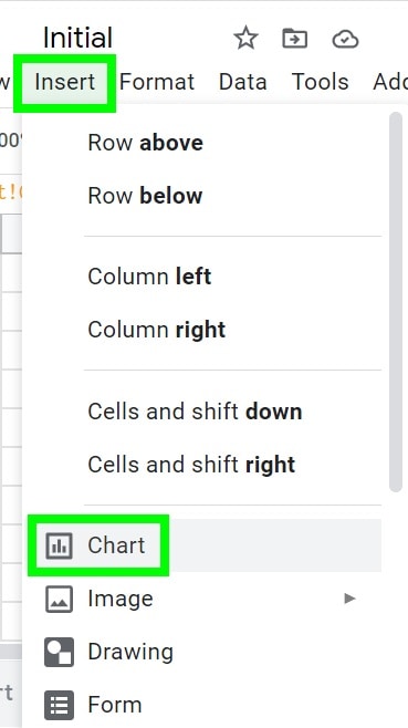
To insert a chart in Google Sheets, click “Insert” on the top toolbar, and then click “Chart” when the drop-down menu appears.
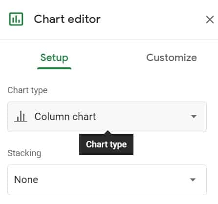
After inserting a chart, you can select the chart type under the “Setup” tab of the “Chart editor”. Simply click the drop down for “Chart type”, and select the type of chart that you want to use (Line, column, etc.).
The key in successfully creating a chart will be to connect the chart to data that is in the correct format.
To connect data / a range of cells to a chart, you can choose either of the following options:
- Select the cells that contain the data that you want to connect to your chart, before inserting the chart
- Insert the chart, and then in the chart editor, in the “Data range” field, type the range of cells that contains the data that you want to connect to your chart
The article that is linked above will show you the format that your data needs to be in to use a variety of Google Sheets charts.
I walk you through the process of getting your data into the proper format and connecting it to charts step by step, in my Google Sheets dashboards course.
Conditional Formatting
Conditional formatting is another great way that you can make your data stand out visually when building dashboards.
I often refer to conditional formatting as “Automatic Color Coding”.
Conditional formatting allows you to set “rules” for a specified range of cells. These conditional formatting rules allow you to specify how you would like the cells to be formatted if a certain condition is met.
This is an incredibly valuable feature that I use all of the time to make my spreadsheet dashboards very easy to read.
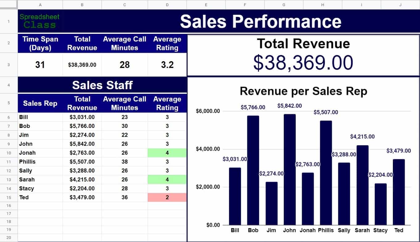
For example, in the image below you can see that conditional formatting has been applied to the “average rating” column, so that the cells will turn red if the rating is low, and so that the cells will turn green if the rating is high.
Content created by Corey Bustos / SpreadsheetClass.com
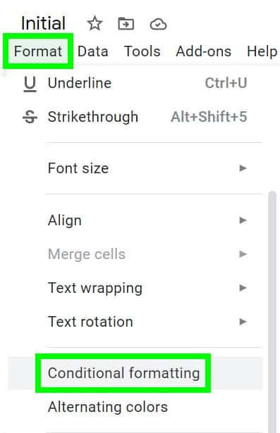
To apply conditional formatting, click “Format” on the top toolbar, and then click “Conditional formatting”.
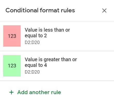
Doing this will open the “Conditional format rules” menu, where you can add rules, and specify what type of formatting will be applied when a specified condition is true / criteria is met.
The image below shows the conditional format rules that control the conditional formatting in the dashboard example above, where the cells turn green if the average satisfaction rating is high (4 or more), and where the cells turn red if the rating is low (2 or less).
Sparklines
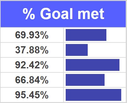
Sparklines are possibly the coolest thing in Google Sheets. SPARKLINE is a special formula that you can use to create a chart inside of a single spreadsheet cell.
As you can see in the image above, the blue bar chart sparklines represent the percentages listed in the column to the left of the sparklines.
Sparklines make it easy to create a chart for every row of data in your spreadsheet, even if there are thousands of rows.
By setting the sparkline “Options”, you can use sparklines in many different ways, such as selecting from different chart types, specifying colors, and setting custom maximum values.
An example of the SPARKLINE formula is shown below.
=SPARKLINE(A1,{“charttype”,”bar”;”max”,100;”color1″,”blue”})
In the formula above, note that chart type is set to “bar”, the color of the bar is set to “blue”, and the maximum value is set to “100”. The data that the sparkline actually represents is specified as cell A1. So the value that is in cell A1 will determine how long the bar in the chart will be.
My favorite sparkline chart type is the bar chart. Line chart sparklines are the default chart type that will display when using the SPARKLINE formula, and these line chart sparklines are very useful for showing trends.
Now you know how to build a Google Sheets dashboard from start to finish!
Dashboards are incredibly valuable tools for businesses to have, and so having the ability to build dashboards makes you an incredibly valuable asset in the professional world.