

In this lesson, I am going to go over a very simple tutorial of building a Google Sheets dashboard. This will be a great lesson to begin with, if you want to create a dashboard from start to finish for the first time.
This is the simplified version of the "basic sales dashboard". This "Fast & Simple" version uses the same data as the "Basic Sales Dashboard", but has fewer features, and can be built even faster.
Download the raw data: Revenue Report CSV
Watch the video below to learn how to build the dashboard
This is just a part of an entire dashboards course.
If you want to learn more about analyzing data and building dashboards in Google Sheets, check out the complete free dashboards course here.
To have quick access to all the best Google Sheets formulas, get your free formulas cheat sheet.
The video below should serve as your main instruction, but below I will go over the general process that is involved in creating a dashboard / this dashboard. Remember that this lesson is a simplified version of the full basic sales dashboard, and so both the video and the article are meant to be kept simple, as you can learn much more in the full / extended tutorial of the basic sales dashboard.
Here are a couple basic sales tracker templates that you can use to manually track sales.
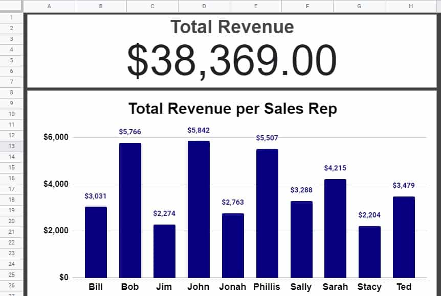
The image above shows the end result of what we will build. We will go from plain, raw data, to a finshed dashboard with professional charts!
Step 1: Import the raw data
First, we will import the raw csv data into a blank Google spreadsheet. If you haven't already, download the data by clicking the link at the top of this page. The file will go into your downloads folder.
Rename the tab in the sheet to "Import"
As described in the video, we will click "File", then click "Import", then click "Upload", then click "Select a file from your device", then double-click the "Revenue Report" file. Google Sheets will upload / import the data into your spreadsheet.
Format the headers in the first row to make them easy to see. Also, freeze the first row.
The data shows how much revenue was earned on a list of sales calls, and which sales representative places each call. We are going to use this data to calculate some totals, and ultimately to display the data in charts. For this particular dashboard, we are only concerned with the column that shows revenue (E), and the column that shows the sales rep (C). In the full version of this dashboard tutorial (Linked at top) we will use more of the data that is included in the report.
Step 2: Calculate the totals / analyze the data
The next step will be to calculate the total revenue for the entire company, and the revenue earned for each sales representative. We will create a new tab to make these calculations, so that our "Import" tab can be used just for raw data.
Create a new tab, and name it "Totals".
Enter the following headers: Cell A1 = "Total Revenue". Cell C1 = "Sales Rep". Cell A1 = "Revenue".
Format the headers to make them easy to read. Freeze the first row.
First, use the SUM function in column A to add up all of the revenue on the entire report. (Sum column E from the "Import" tab)
Then, use the UNIQUE function in column C to create a unique list of each sales representative. (Remove duplicates from column C on the "Import" tab)
Then, combine the SORT function with the UNIQUE function, to alphabetize the list of names.
Finally, use the SUMIF function in column D to calculate the total revenue earned for each sales rep. (Sum column E from the "Import" tab, where the contents of cell C2 is found in column C of the "Import" tab.
Copy the SUMIF formula down the column to calculate the revenue earned for each sales rep.
Step 3: Create data visuals
Now it's time to represent the calculated totals / analyzed data, with charts.
Create a new tab, an name it "Dashboard".
Turn the background / fill color of all the cells to dark grey or a chosen color.
Create a scorecard chart, and connect it to the data range that shows the total revenue.
Format the chart as desired.
Create a column chart, and connect it to the data range that shows the revenue earned for each sales representative.
Format the chart as desired.
After following these steps, you will have a complete dashboard!