
There are a wide variety of charts and graphs that you can use in Google Sheets, which will make your spreadsheet look amazing, and that will make your data very easy to analyze. In this article I’ll show you how to insert a chart or a graph in Google Sheets, with several examples of the most popular charts included.
To make a graph or a chart in Google Sheets, follow these steps:
- Click “Insert”, on the top toolbar menu
- Click “Chart”, which opens the chart editor
- Select the type of chart that you want, from the “Chart type” drop-down menu
- Enter the data range that contains the data for your chart or graph
- (Optional) Click the “Customize” tab, and adjust the chart settings and styling
Throughout this lesson you will find links to other useful lessons about charts in Google Sheets. Check out this lesson to learn how to chart data from another sheet.
You can also learn how to move a chart to another sheet, or how to copy chart style / duplicate charts.
If you want to take a full course on building charts, building dashboards, and analyzing data, check out the free “Dashboards” course.
The video above is the quick version that shows you how to create a chart (& how to customize it) in Google Sheets. The video at the bottom of this page is the extended video that shows how to create and customize a wide variety of charts. Choose the video that best suits your needs!
Get your FREE Google Sheets cheat sheet
How to make a graph or chart in Google Sheets (Detailed instructions):
Open a new or existing Google spreadsheet, and enter the data for your chart into the spreadsheet cells. Make sure that you include headers with your data.
(Optional)- Select the range of cells that contains the data that you want your chart to link to, before inserting the chart. If you do this, then the data range will already be filled in when you open the chart editor. When selecting the range before inserting the chart, Google Sheets will attempt to fill in your chart title and axis titles based on your headers.
Insert a chart by doing either of the following:
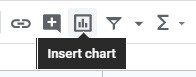
- Option 1- Click the button in the toolbar that looks like a column chart, which is labeled “Insert chart”
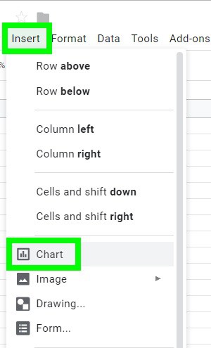
- Option 2- On the top toolbar, click “Insert”, which will expand a menu as shown below, then click “Chart” after the menu expands
After inserting a chart, the chart editor will open, as shown below. Notice that when the chart editor first opens, the “Setup” tab will be selected by default. (We will go over the “Customize” tab later)
If you select the data range before inserting your chart, you will notice that the ”Data range” field will already be filled in.
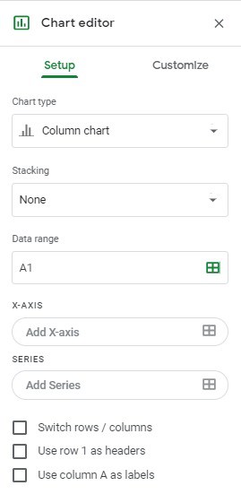
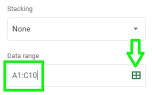
To set the data range (the range of cells that your chart will refer to), type the range directly into the “Data range” field that is on the chart editor.
Or, if you click the icon that looks like a spreadsheet, a small window will pop up, and you can type the data range there as well.
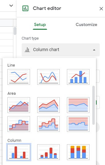
Select the type of chart or graph that you want, by clicking on the drop-down menu where it says ”Chart type”.
Now you have created a chart in Google Sheets that is linked to data in the spreadsheet cells.
When the data in the cells changes, so will the chart that it is linked to.
If you want, you can click the “Customize” tab and change the way the graph looks and functions.
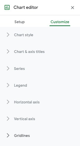
The image below shows the “Customize” menu and the variety of options that you can adjust within it. Further below, I will go over customizing charts in detail.
In this article, I will show you how to create the following charts and graphs:
- Column Chart
- Multiple Series Column Chart
- Stacked Column Chart
- Line Chart
- Combo Chart
- Pie Chart
- Bar Chart
- Multiple Series Bar Chart
- Histogram
I’ll show you how to set up the source data for each of these chart types, and I’ll also show you how to customize the charts so that they look and operate how you want them to.
If you want to learn about any of the charts that are not mentioned in this article, this page about chart types from Google will teach you about every different kind of chart.
Click here to get your free Google Sheets cheat sheet
Customizing Charts and Graphs:
There are lots of ways that you can customize your charts in Google Sheets. To customize, open the chart editor, and then click the “Customize” tab.
If the chart editor is not already open, use one of the following methods to open it again:
- Double click on a chart in any location to open the chart editor
- Or, click on a chart once, then click the three dots in the upper right corner of the chart, and then click “Edit chart…”
- Or, after clicking on a chart one time, you can click the portion of the chart that you want to edit and Google Sheets will open that specific menu in the chart editor
Each of the charts in the examples in this article has been customized. For each example I’ll tell you how to change the most important settings for each chart so that the critical features are activated. Then, if you want… you can follow the optional instructions for customization.
In two of the examples (for column and pie charts), I’ll go over customizing in even more detail than the other examples, and show you before and after images of how customizing your charts can make them look amazing.
Here I will go over customizing charts in general, but in the examples below you will find specific instructions on how to customize each chart.
There are many options available in the “Customize” tab of the chart editor, and the best way to begin understanding them beyond reading this article, is to make your first graph, and then start clicking the options to see what they do. Some options are more intuitive than others, but with a little bit of experimentation you can quickly learn what each of the options do.
When you begin to open these menus and options you will see that there are options that change the functionality of the chart, and many options which simply change the appearance. Of course functionality is the most important feature to make sure that you have correctly implemented with your chart, but changing the appearance of charts can go a long way towards making them easy to use and read.
Most charts contain the same menus, but you’ll see that special menus appear for some chart types.
Below are the different menus that can be expanded while in the “Customize” tab of the chart editor, for a column chart.
Chart style
Here you can change a few settings that apply to the entire chart, such as the background color, and the font type.
Chart & axis titles
Here you can set or change the title of your chart, or the titles of each axis. You can also style the titles, such as aligning them, making them bold, and changing the color of the text. If you want, you can also use this menu to add a chart subtitle.
Series
This is quite an important menu, as this is where you can adjust the appearance of the lines / bars / columns / pie slices. This includes the ability to change the color of each “series”, and add / customize data labels.
Learn how to add a series to a chart.
Learn how to change the order of a series.
Legend
You can enable or disable the legend in this menu, and you can change its position too. You can adjust the font of the legend as well.
Horizontal axis
Here you can adjust the font of the horizontal axis labels, and you can also adjust the slant of the labels in the horizontal axis.
Vertical Axis
In this menu you can adjust the font of the vertical axis labels, and you can also adjust the numbers in the vertical axis, such as setting the minimum and maximum values and changing the number format of the vertical axis. If you don’t set the minimum and maximum values, Google Sheets will do a great job of automatically adjusting them based on the data that you are referring to with your chart.
Gridlines
You can use this menu to add gridlines to your chart.
I recommend making the following style adjustments to any chart or graph that you use, wherever possible, so that your charts look professional and easy to read:
- Add / modify the chart title if needed. Align the title, and adjust the font so that it is easy to read
- Modify the vertical/horizontal axis titles as needed
- Make font adjustments to vertical/horizontal axis titles, as well as to the vertical/horizontal axis labels
- Choose colors for each different series (if applicable), so that colors are easy to tell apart. If possible, make the colors relevant to the data that it represents (i.e. blue for boys and pink for girls)
- Add data labels to the series, so that the exact values for each data point can be viewed
Making the font in your chart bold can instantly make the chart easier to read, and so I personally apply bold font to every option. I also like to make the default grey fonts darker, so that they are even easier to see.
By making these changes your chart will go from looking very plain, to looking bright and professional.
To create the charts that are demonstrated below in your own spreadsheet, simply copy and paste the data that is provided with each example into cell A1, and follow the steps listed to insert your chart, and then customize it in the way that is shown in the pictures.
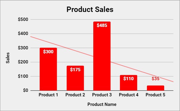
How to create a column chart in Google Sheets
First, I’ll show you how to create a column chart in Google Sheets.
Column charts are one of the most commonly used charts, and are great for displaying and comparing many different types of data.
We will start with a simple example where there are only two columns of data.
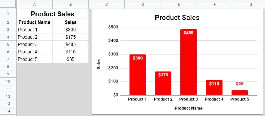
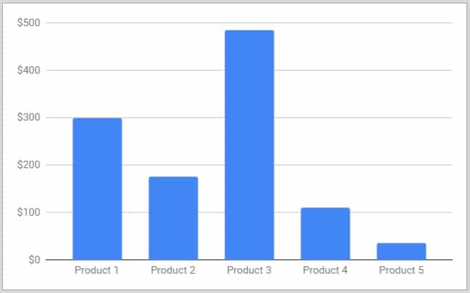
Here is the data that we will use for the column chart, which shows the total sales amount for five different products.
| Product Name | Sales |
| Product 1 | $300 |
| Product 2 | $175 |
| Product 3 | $485 |
| Product 4 | $110 |
| Product 5 | $35 |
To create a column chart in Google Sheets, follow these steps:
- Copy and paste the data above, into your spreadsheet in cell A1
- Click “Insert”, on the top toolbar, and then click “Chart” to open the chart editor
- Select “Column Chart”, from the “Chart type” drop-down menu
- In the “Data range” field, type “A2:B7” to set the range of cells that your column chart refers to
After following the steps above, you will have a column chart that looks similar to the chart below. Follow the customization steps to make this column chart look like the chart that is shown above.
(If you selected the data range before inserting the chart into your sheet, instead of typing the data range into the chart editor… Google Sheets will try to fill in your chart and axis titles for you)
Chart customization
Now let’s change the appearance of your column chart, so that it is easier to read and so that the columns are colored red.
Follow these steps to customize the column chart:
- Click the “Customize” tab in the chart editor
- Open the “Chart & axis titles” menu
- Make sure that “Chart Title” is selected in the drop-down menu
- Type “Product Sales” in the “Title Text” field
- Center align the title, make it bold, and change the text to black
- Select “Horizontal axis title” from the drop-down menu, type “Product Name” into the field that says “Title text”, and then make the title text black and bold
- Select “Vertical axis title” from the drop-down menu, type “Sales” into the field that says “Title text”, and then make the title’s text black and bold
- Open the “Series” menu
- Change the “Sales” series color to red
- Check the “Data labels” box
- Make the data labels bold
- Open the “Horizontal axis” menu, and make the horizontal axis labels black and bold
- Repeat the previous step for the “Vertical Axis” menu
After following all of the steps above, your column chart will look like the chart at the beginning of this example!
How to create a multi-series column chart in Google Sheets
Now let’s create a column chart that has more than one series of data. In other words, we will create a column chart that displays multiple data points for each horizontal axis value.
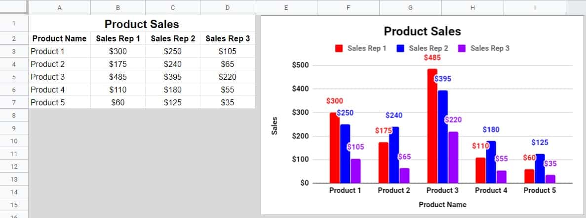
In this example we have added two columns to the data that we used in the last example, so that now the data displays product sales for three different sales representatives.
Here is the data that we will use for the multi-series column chart, which shows the total sales amount for five different products, for three different sales reps.
| Product Name | Sales Rep 1 | Sales Rep 2 | Sales Rep 3 |
| Product 1 | $300 | $250 | $105 |
| Product 2 | $175 | $240 | $65 |
| Product 3 | $485 | $395 | $220 |
| Product 4 | $110 | $180 | $55 |
| Product 5 | $60 | $125 | $35 |
As you can see in the example image, there is a group of columns for each product, where the individual columns represent each sales representative. You can also see that when there are multiple series in the data range of a column chart, Google Sheets will enable the legend, which will show the color of each series, and the labels of your series based on the headers in your source data.
Note: If you followed the last example, if you want… you can simply change the data range in your previous column chart to follow this example, instead of needing to insert a new chart.
To create a column chart that has more than one series in Google Sheets, follow these steps:
- Copy and paste the data that is provided above, into your spreadsheet in cell A1
- Click “Insert” on the top toolbar menu, and then click “Chart” which will open the chart editor
- Select “Column Chart”, from the “Chart type” drop-down menu
- In the “Data range” field, type “A2:D7” to set the range that your chart refers to
Multi-series Column Chart Customization
- In the chart editor, click the “Customize” tab
- Open the “Series” menu
- Select “Sales Rep 1” from the drop-down menu, then change the color of that series to red
- Select “Sales Rep 2” from the drop-down menu, then change the color of that series to blue
- Select “Sales Rep 3” from the drop-down menu, then change the color of that series to purple
- While still in the “Series” menu, enable “Data labels”
- Set and adjust your chart title and axis titles if desired
- As described in detail in the previous example, make the text for the titles and axis labels bold, and black. You can also adjust the font of the legend
How to create a stacked column chart in Google Sheets
Stacked column charts provide a very unique and useful way of comparing data when your column chart has more than one series.
In a stacked column chart, as the name implies… the columns from each series are stacked on top of each other, rather than displayed side by side.
Here is the data that we will use for the stacked column chart (same data from last example), which shows the total sales amount for five different products, for three different sales representatives.
| Product Name | Sales Rep 1 | Sales Rep 2 | Sales Rep 3 |
| Product 1 | $300 | $250 | $105 |
| Product 2 | $175 | $240 | $65 |
| Product 3 | $485 | $395 | $220 |
| Product 4 | $110 | $180 | $55 |
| Product 5 | $60 | $125 | $35 |
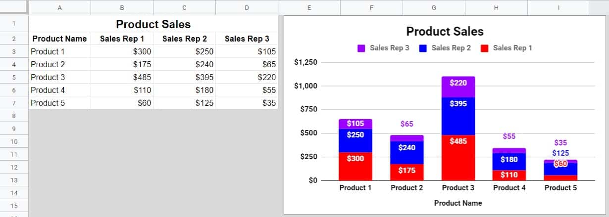
This “stacking” allows you to see the ratio between the data points and to compare them very easily. In this example, the stacking allows us to see the ratio of sales between sales reps 1, 2 and 3… where their combined sales are represented as the entire column. But the individual contribution that each sales rep made towards the total, is visually represented by colored portions of the column.
We will use the same data that we used in the last example, as well as the same colors etc. The only thing that is different here, is the “Stacking” of the chart columns.
If you followed that last example, all you need to do to create this chart is to make one simple adjustment. In the chart editor under the “Setup” tab, expand the drop-down menu where it says “Stacking”, and select “Standard”.
If you are beginning with this example, then below I have given brief instructions on how to create this chart from scratch. See the previous example(s) for more details on creating and customizing the column chart.
To create a stacked column chart in Google Sheets, follow these steps:
- After copying/pasting the data for this example into cell A1, insert a chart into your spreadsheet
- Select “Stacked Column Chart” from the “Chart type” menu, and set the data range to “A2:D7”
Stacked Column Chart Customization
- Change the color of each series so that “Sales Rep 1” is red, “Sales Rep 2” is blue, and “Sales Rep 3” is purple
- Add data labels, and if desired check the option for “Total data labels”, which will display a total for each entire column.
- Change the titles if you want, and then adjust the fonts of titles and labels so that they are easy to read
Note: On the “Setup” tab in the chart editor, for the “Stacking” option, if you select “100 %”, the columns will adjust so that they are all the same size, despite them having different values. This is an even better option for viewing the ratio of each series.
Data labels are very important when using stacked column charts, and especially when using a “100% stacked column chart” data labels are even more important since the size of the column only represents a ratio/percentage, and not the value itself.
How to create a line chart in Google Sheets
In this example I will show you how to create a line chart in Google Sheets.
Line charts are great for viewing trends in data over time.
The line chart below shows the yearly sales performance for two different store locations, over a period of ten years.
Here is the data that we will use for the line chart, which shows the total sales amount for two different stores, from the year 2010 to the year 2019.
| Year | Store 1 | Store 2 |
| 2010 | $43,471 | $12,175 |
| 2011 | $40,128 | $20,788 |
| 2012 | $33,819 | $27,890 |
| 2013 | $37,070 | $21,821 |
| 2014 | $21,826 | $19,437 |
| 2015 | $25,636 | $31,272 |
| 2016 | $26,424 | $34,912 |
| 2017 | $16,101 | $45,660 |
| 2018 | $23,445 | $36,018 |
| 2019 | $27,399 | $22,797 |

To create a line chart in Google Sheets, follow these steps:
- Copy and paste the data that is provided above, into your spreadsheet in cell A1
- Click “Insert” on the top toolbar menu, and then click “Chart” to open the chart editor
- Select “Line Chart”, from the “Chart type” drop-down menu
- In the “Data range” field, type “A2:C12” to set the range that your line chart refers to
Line Chart Customization
- In the chart editor, click the “Customize” tab
- Expand the “Series” menu
- If you want, adjust the color of each series/line
- Set and adjust your chart title and axis titles to match the example chart above, or change them to say what you want them to
- Adjust the text for the titles and axis labels, and make them bold and black
How to create a combo chart in Google Sheets
Now that we have covered both column charts and line charts, let’s create a combo chart.
A combo chart uses a combination of chart types, such as the chart in this example which uses both columns and a line to display data. A combo chart will typically have one scale of numbers on the left vertical axis for one of the data types, and a different scale of numbers on the right axis for the other data type.
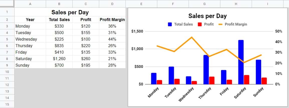
Combo charts are commonly used to show the relationship between total sales, profit, and profit margin… where total sales and profit are represented as columns on the chart, and profit margin is represented as a line on the same chart.
Here is the data that we will use for the combo chart, which shows the total sales and profit over a period of seven days, as well as the profit margin.
| Year | Total Sales | Profit | Profit Margin |
| Monday | $330 | $120 | 36% |
| Tuesday | $500 | $155 | 31% |
| Wednesday | $225 | $100 | 44% |
| Thursday | $835 | $220 | 26% |
| Friday | $410 | $135 | 33% |
| Saturday | $1,260 | $260 | 21% |
| Sunday | $700 | $195 | 28% |
To create a combo chart in Google Sheets, follow these steps:
- Copy and paste the data that is provided above into your spreadsheet in cell A1
- Click “Insert” on the top toolbar menu, and then click “Chart” which will open the chart editor
- Select “Combo Chart”, from the “Chart type” drop-down menu
- In the “Data range” field, type “A2:D9” to set the range that your combo chart refers to
Combo Chart Customization
- In the chart editor, click the “Customize” tab
- Open the “Series” menu
- Select the “Total Sales” series from the drop-down menu
- Select “Columns” from the “Type” drop-down menu
- Select “Left Axis” from the “Axis” drop-down menu
- Select the “Profit” series, then select “Columns”, and then select “Left Axis”
- Select the “Profit Margin” series, then select “Line”, and then select “Right Axis”
- Set your chart title to “Sales per Day”
- Make the font for the chart title and labels bold and black so that they are easy to read
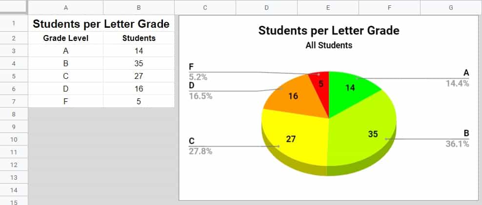
How to create a pie chart in Google Sheets
Another very useful and popular chart to use in Google Sheets, is the pie chart.
Pie charts are very simple, and do an amazing job of displaying the ratio of parts that equal a “whole” when combined.
The size of each pie slice represents the size of the value that it refers to, in comparison to the total of all the values that compose the pie chart’s data.
In this example we will display the distribution and number of students who have each possible letter grade in a course (A, B, C, D, F).
Here is the data that we will use for the pie chart, which shows the total number of students that received each letter grade.
| Grade Level | Students |
| A | 14 |
| B | 35 |
| C | 27 |
| D | 16 |
| F | 5 |
To create a pie chart in Google Sheets, follow these steps:
- Copy and paste the data that is provided above, into your spreadsheet in cell A1
- Click “Insert”, on the top toolbar, and then click “Chart”, which will open the chart editor
- Select “Pie Chart”, from the “Chart type” drop-down menu
- In the “Data range” field, type “A2:B7” to set the range that your pie chart refers to
After following the steps above, you will have created a pie chart that looks similar to the picture below. Follow the customization steps to make this pie chart look like the chart that is shown above.
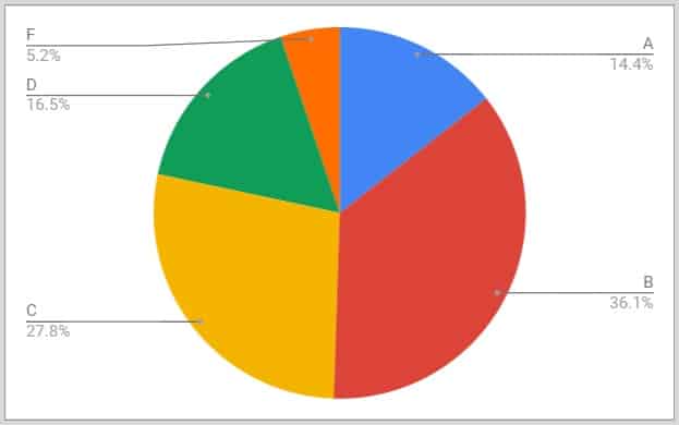
(If you selected the data range before inserting the chart into your sheet, instead of typing the data range into the chart editor, Google Sheets will fill in the chart and axis titles automatically)
Pie chart customization
Let’s change the appearance of the pie chart, to make it look vibrant, professional, and easy to read.
Follow these steps to customize the pie chart:
- Click the “Customize” tab in the chart editor
- Open the “Chart Style” menu
- Check the box that says “3D”
- Open the “Chart & axis titles” menu
- Select “Chart Title” from the drop-down menu
- Set the chart title to “Students per Letter Grade”
- Center align the pie chart title, then change the color of the title text to black and make it bold
- Select “Chart subtitle” from the drop-down menu
- Set the chart’s subtitle to “All Students”
- Select “Horizontal axis title” from the drop-down, type “Product Name” into the field that says “Title text”, and then make the title’s text black and bold
- Select “Vertical axis title” from the drop-down, then type “Sales” into the field that says “Title text”, and then make the title’s text black and bold
- Open the “Pie Slices” menu
- Change the colors for the pie slices to the following: A = Green, B = Light Green, C = Yellow, D = Orange, F = Red
- Open the “Pie Chart” menu
- Select “Value”, from the “Slice label” drop-down menu
- Make the slice labels bold
- Open the “Horizontal axis” menu, and then make the axis labels black and bold
- Repeat the previous step for the “Vertical Axis” menu
- Open the “Legend” menu
- Make the font of the legend bold so that it is easier to see
Check out this lesson to learn more about adding slice labels and data labels for charts.
After following all of the steps above, your pie chart will look like the chart at the beginning of this example.
Note: Slice Labels (i.e. Data Labels) are important to use with pie charts, because they will allow you to see the numerical values that the pie slices represent, instead of just the percentages.
This content was originally written on SpreadsheetClass.com
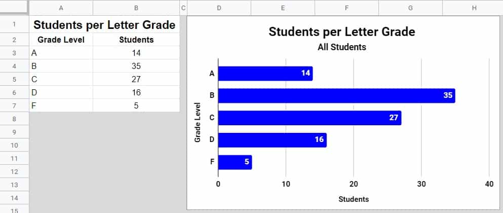
How to create a bar chart in Google Sheets
The bar chart is another very commonly used chart that can display and compare a wide variety of data.
Bar charts are like column charts, except that their bars are horizontal. Bar charts are often used in situations where something is being counted, such as in surveys.
In this example we will use the same data that we used in the last example, to achieve the same task of displaying the distribution of students per letter grade, but this time we will use a bar chart.
Here is the data that we will use for the bar chart (same data from last example), which shows the total number of students that received each possible letter grade in a class.
| Grade Level | Students |
| A | 14 |
| B | 35 |
| C | 27 |
| D | 16 |
| F | 5 |
To create a bar chart in Google Sheets, follow these steps:
- Copy and paste the data that is provided above, into your spreadsheet in cell A1
- Click “Insert” on the top toolbar menu, and then click “Chart” which will open the chart editor
- Select “Bar Chart” from the “Chart type” drop-down menu
- In the “Data range” field, type “A2:B7” to set the range that your bar chart refers to
Bar Chart Customization
- In the chart editor, click the “Customize” tab
- Open the “Series” menu
- Change the “Students” series color to blue
- Check the “Data labels” box
- Set and adjust the chart title, subtitle, and the axis titles
- Make the text for the title and the axis labels black and bold
How to create a multi-series bar chart in Google Sheets
Bar charts can also be used to display more than one series, just like column charts.
In this example we have added one column to the data that we used in the previous example, so that now the data shows the distribution of letter grades earned in a class, between boys and girls.
Here is the data that we will use for the multi-series bar chart, which shows the total number of boys and girls that received each possible letter grade in a class.
| Grade Level | Boys | Girls |
| A | 14 | 12 |
| B | 35 | 39 |
| C | 27 | 27 |
| D | 16 | 13 |
| F | 5 | 3 |
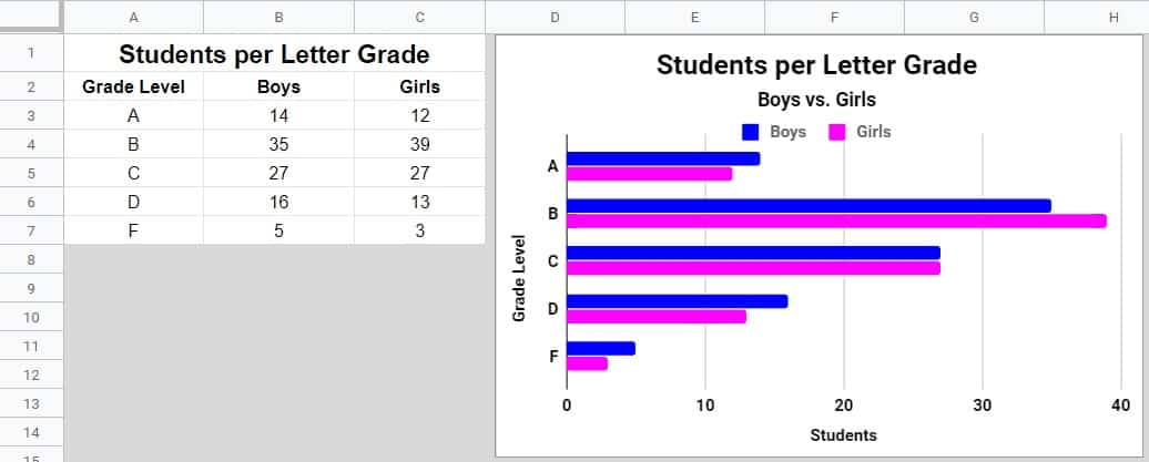
As you can see in the example image, there is a group of two bars for each letter grade (1 bar for boys and 1 bar for girls).
Note: If you followed the last example, if you want… you can simply change the data range in your previous bar chart to follow this example, instead of needing to insert a completely new chart.
To create a bar chart that has more than one series in Google Sheets, follow these steps:
- Copy and paste the data that is provided above into your spreadsheet in cell A1
- Click “Insert” on the top toolbar menu, and then click “Chart” which will open the chart editor
- Select “Bar Chart”, from the “Chart type” drop-down menu
- In the “Data range” field, type “A2:C7” to set the range that your bar chart refers to
Multi-series Bar Chart Customization
- In the chart editor, click the “Customize” tab
- Open the “Series” menu
- Select “Boys” from the drop-down menu, then change the color of that series to blue
- Select “Girls” from the drop-down menu, then change the color of that series to pink
- While you are still in the “Series” menu, enable “Data labels” by clicking the checkbox
- Adjust your chart title, subtitle, and axis titles
- Make the text for the titles and axis labels bold, and black
How to create a histogram chart in Google Sheets
In this example, I’ll show you how to create a histogram in Google Sheets.
Histogram charts show the distribution and frequency of values that fall within specified ranges. In other words, histograms count how many values from a data set that are within certain ranges.
The histogram chart in this example will show how many students earned scores from four equal ranges between 0 and 100, which means that each individual range or “bucket” will contain 25 numbers.
Here is the data that we will use for the histogram chart, which shows a list of students and their test scores.
| Student Name | Test Scores |
| Student 1 | 67 |
| Student 2 | 45 |
| Student 3 | 76 |
| Student 4 | 25 |
| Student 5 | 89 |
| Student 6 | 92 |
| Student 7 | 7 |
| Student 8 | 66 |
| Student 9 | 71 |
| Student 10 | 78 |
| Student 11 | 73 |
| Student 12 | 54 |
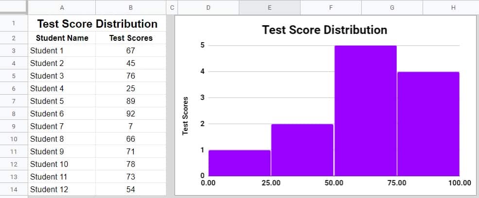
To create a histogram chart in Google Sheets, follow these steps:
- Copy and paste the data that is above, into your spreadsheet in cell A1
- Click “Insert” on the top toolbar, and then click “Chart”, which opens the chart editor
- Select “Histogram Chart”, from the “Chart type” drop-down menu
- In the “Data range” field, type “A2:B14” to set the range that your histogram chart refers to
Histogram Chart Customization
- In the chart editor, click the “Customize” tab
- Open the “Series” menu
- Select “Test Scores” from the drop-down menu, then change the color of the series to purple
- Open the “Horizontal axis” menu
- Set the minimum value to 0, and the maximum value to 100
- Open the “Histogram” menu
- Set the bucket size to 25
- Set and adjust your chart title, subtitle, and axis titles to match the example chart above, or if you want to, you can change them to anything that you want
- Adjust the text for the titles and axis labels, and make them bold and black
Extra customization: Chart background color and trendlines
Here are a couple of extra customization options for Google Sheets charts that we didn’t cover in the previous examples, which are very useful.
Here I’ll use the column chart from the first example in this article (which shows the total sales for a variety of products), to show you how to change the background color of a chart, as well as how to add a trendline to a chart.
On the chart below, you’ll see that the background color has been changed to light grey, and that a trendline has been added.
How to change the background color of a chart in Google Sheets
Changing the background color of your chart can make the chart look very appealing, and can help you match the style of your chart to the style of your entire spreadsheet.
To change the background color of a chart in Google Sheets, do the following:
- Open the chart editor by double clicking on your chart
- Click the “Customize” tab
- Open the “Chart style” menu
- Click the menu where it says “Background Color”, to open the color palette
- Select the background color that you want
How to add a trendline to a chart in Google Sheets
Trendlines are usually used to observe trends in data over time, but there are several different types of situations that trendlines can be used in.
Trendlines are used with column charts.
In this example, the downward slope of the trendline shows that when new products are released, they tend to make less money than the previous products released.
To add a trendline to a chart in Google Sheets, do the following:
- Open the chart editor, by double clicking on the column chart that you want to add a trendline to
- Click the “Customize” tab
- Open the “Series” tab
- Check the box that says “Trendline”
Why charts are so valuable
Using charts and graphs to display your data in Google Sheets will make your sheets look amazing and easy to read for both you and any others that you share it with.
Charts will allow you to gather valuable insights and to make educated, data-driven decisions.
Simply choose the chart that best fits your data, and the task you want to achieve! Now you know how to create and customize a wide variety of charts in Google Sheets, which is a very handy and valuable skill to have.
2 formatting tricks to make your charts look better
Here are two simple things that you can do to make your charts look much better. These tips will not just make the chart itself look better, but will make the charts look better within your spreadsheet in general when you are building reports and dashboards.
Removing gridlines from the sheet for a clean background
To make your charts look great in the spreadsheet, it’s best to turn the cells behind the charts into a nice clean background. The easiest way to do this is to remove the gridlines in the tab that holds your charts. You can remove gridlines by clicking “View” > “Show” > “Gridlines”.
Removing borders from the charts
After you have a clean background, one way to make your charts look even better is to remove the border from the chart. To do this, double-click on the chart to open the chart editor, click the “Customize” tab, click the “Chart style” menu, click the “Chart border color” menu, then click “None”. After this your chart will not have a border and will blend into the background with a very clean look.
Or if you want you can customize the border color and thickness to make it match the color scheme of your choice.
Get a FREE Google Sheets formulas cheat sheet
Extended video on how to use charts: