
When you are creating a Google Sheets chart, something that can be extremely useful is "Data labels" which are the values that each bar / column etc. represents. For example when you create a column chart, by default there will be numbers on the y-axis that will give you a rough idea of each column's value, but if you actually want to see the exact value that each column represents then you can use data labels to display this directly on the chart.
In this lesson I'll show you how to add / edit data labels to charts in Google Sheets, including how to add slice labels to pie charts which is a slightly different process.
To add data labels to a chart in Google Sheets, follow these steps:
- Double-click on the chart to open the chart editor (you can also click once on the chart, click the three dots in the upper-right corner, then click "Edit chart")
- Click the "Customize" tab
- Click "Series"
- Click the "Data labels" checkbox
- Optional: Customize the color, font etc. of the data labels
After following the steps above, your chart will now have data labels, and the columns, bars, etc. will display the actual values that each column / bar etc. represents.
See below for detailed examples with images.
Check out the lesson linked below if you want to learn how to create and customize all the different kinds of charts.
Learn how to create charts and graphs
Click here to get your free Google Sheets cheat sheet
Adding data labels to a chart in Google Sheets
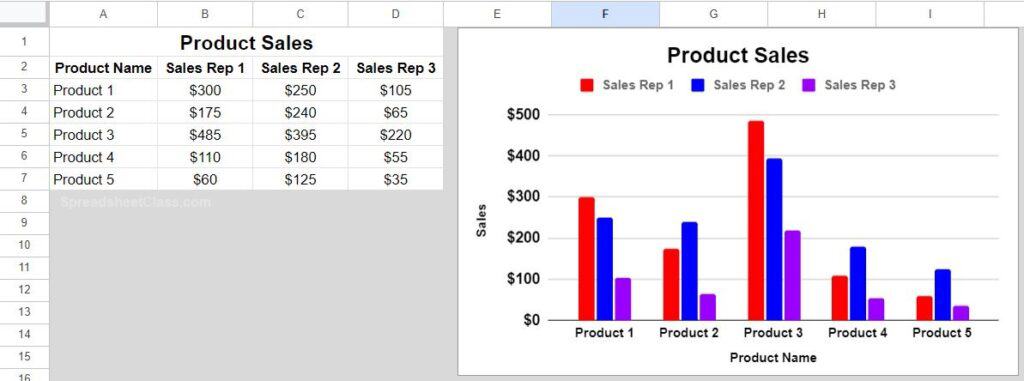
So in this example, we are going to add data labels to a column chart that displays sales data. As you can see in the image below, the columns do not have data labels / the columns do not display the exact values that each column represents. We can see the y-axis values and get a rough idea of each column's value, but we want to display the exact numbers.
To add data labels to the chart, follow the steps below.
Double-click on the chart to open the chart editor.
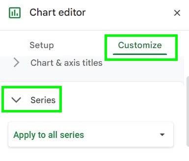
The chart editor is a menu that pops up on the right. Click the "Customize" tab.
Now click the "Series" menu. Note that the default in the "Series" menu is to "Apply to all series", and so if your chart has multiple series (like this example) then you can choose to add data labels to an individual series, or all series, by choosing the series you want to add data labels to from the dropdown.
Scroll down in the "Series" menu, and click the checkbox that says "Data labels". Google Sheets will display the values that each column represents, directly on the chart.
As you can see in the image below, after enabling data labels on the column chart, each column now displays a number on it, which is the exact value that each column represents. In other words the numbers from the raw data that the chart is connected to, is displayed directly on the chart columns.
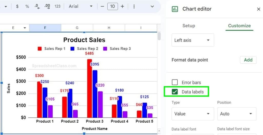
Note that by default the color of the data labels will be set to "Auto", and so the color of the labels will be determined by the color of each series. You can change the color of the series and the label color will change (when set to "auto"), or you can select a custom color for your data labels. You can also customize the data labels by choosing font size, bold, etc.
Data label number format
The "Number format" of the data labels is by default determined by the format of the data that the chart is connected to (Default for "Number format" in the data label setting is set to "From source data").
The "number format" is the format that determines percentage vs. plain number, how many decimals etc. For example, if your data is in percentage format, the data labels on your chart will be in percentage format by default. If you want to change the number format, you can either change the format of the data itself, or you can customize it from the "Number format" menu in the data label options. Again by default it is set to "From source data".
If your data has decimals in it and the data labels look cluttered, you can reduce the number of decimal places, or you can try reducing the size or position of the data labels.
This content was originally created by Corey Bustos / SpreadsheetClass.com
Adding slice labels to a pie chart in Google Sheets
If you want to add data labels to your pie chart, the process is a little different. For pie charts, data labels are called "Slice labels". Slice labels display the actual value that each pie slice represents.
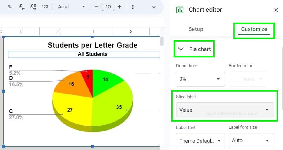
You will still enable them from the chart editor, from the customize tab… but for slice labels you will click on "Pie chart" instead of "Series". Detailed instructions with example images on adding slice labels are further below.
To add slice labels to a pie chart in Google Sheets, follow these steps:
- Double-click on the chart to open the chart editor (or you can click once on the chart, click the three dots in the upper-right corner, then click "Edit chart")
- Click the "Customize" tab
- Click "Pie chart"
- Click the "Slice label" dropdown
- Select the type of slice labels that you want, such as "Value"
- Optional: Customize the color, font etc. of the data labels
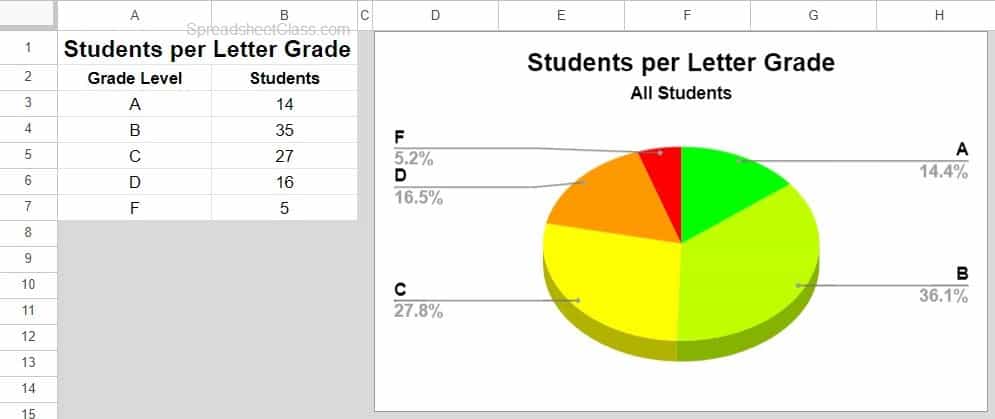
As you can see in the image below, the pie chart does not have data labels / slice labels. The legend displays the percentage that each pie slice represents, but we are going to enable slice labels which will display the actual number value that each pie slice represents / is associated with.
To add slice labels to the pie chart, follow the steps below.
Double-click on the chart to open the chart editor.
Click the "Customize" tab.
Now click the "Pie chart" menu.
Click the "Slice label" dropdown menu
Choose the type of slice labels that you want.
"Label" will display the label / column header. "Value" will display the number that each pie slice represents / the number from the data that each pie slice is connected to. "Percentage" will display the percentage that each pie slice represents. "Value and Percentage" display both the value and the percentage of each pie slice.
As you can see in the image above, after following the steps above the alice labels now display on each pie slice. For example, the legend (by default) displayed that 27.8% of the students received a letter grade of "C", but now that the slice labels are added we can see that 27 students received a letter grade of C.