

In this lesson I am going to show you how to chart multiple series in Google Sheets, where you are charting data with multiple columns per row, or vice versa. For example if you want to chart multiple lines on a line chart, or if you want to have multiple columns for each x-axis value on a column chart.
To chart multiple series in Google Sheets, follow these steps:
- Insert a chart on the tab that you want your chart to appear on (Click "Insert" on the top toolbar, and then click "Chart")
- Select the chart type (Column, Line, Combo, etc.)
- In the "Data range" field, type the range / address for the data that you want to connect to the chart, like this: A1:D12
- Now your chart is connected to data. Since the data has multiple columns and multiple rows, this means that there are multiple "series", and your chart will automatically detect / display multiple series when you enter a range with multiple rows / columns, i.e. a table of data
Detailed examples with illustrations are shown below, in addition to some helpful tips for charting multiple series in Google Sheets.
Click here to learn how to create / customize charts in general.
Click here to get your Google Sheets cheat sheet
How to chart multiple series in Google Sheets (Column Chart)
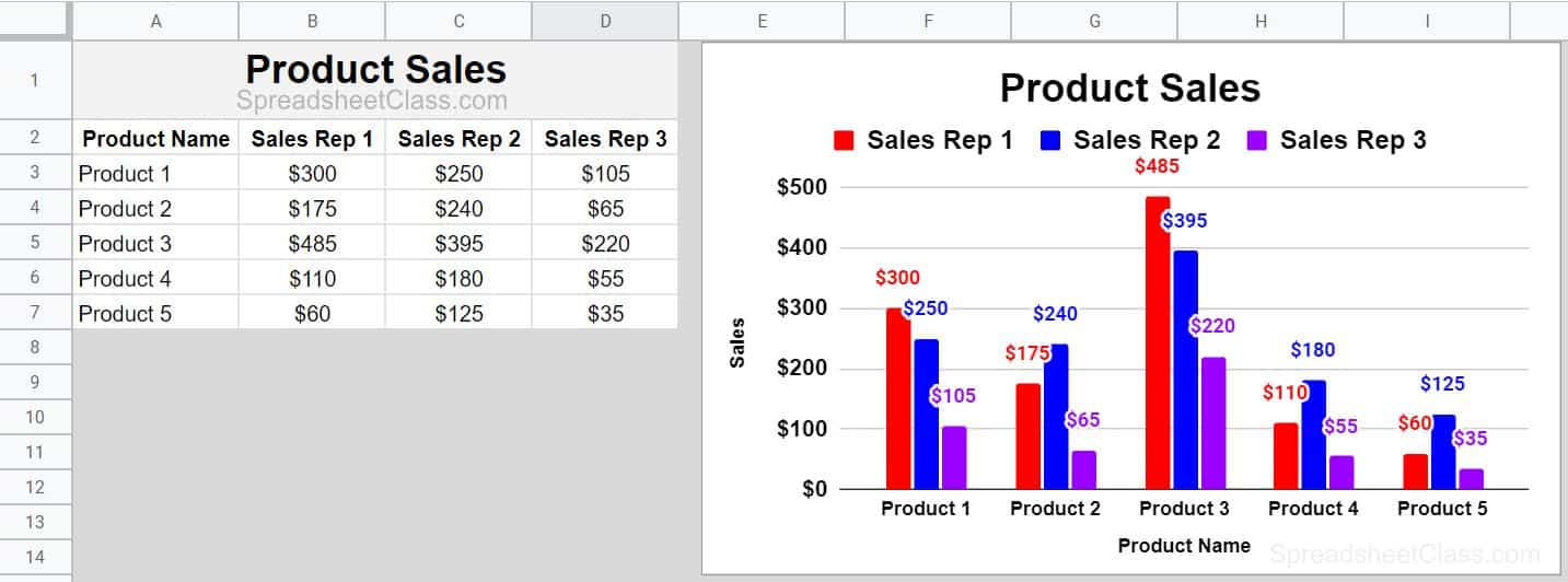
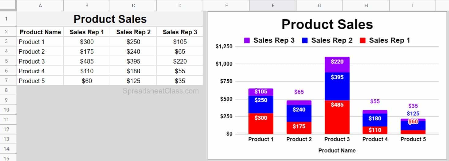
Let's start with an example of charting multiple series with a column chart. As you can see in the image below, the data contains multiple series, because there are multiple sales reps for each product. In this case the products (Product 1, Product 2, etc.) are shown on the x-axis, and the sales reps (Sales rep 1, Sales rep 2, etc.) are displayed.
Since the chart is connected to / refers to this data with multiple series, the chart also displays multiple series by showing multiple columns grouped together for each product. So each product has three different columns that represent how much money was earned for each product, by each different sales rep.
Each series has a different color, which you can adjust in the chart editor menu, under the customize tab, under the "Series" tab.
2 Methods for inserting the chart & connecting data to your chart
So now that you know what a multiple series column chart looks like, as well as the format that the data is in… let's go over how to actually insert the chart and connect your data to it.
To insert a chart in Google Sheets, click "Insert" on the top toolbar, and then click "Chart"
To connect data to a chart / specify the data range for a chart in Google Sheets, do either of the following:
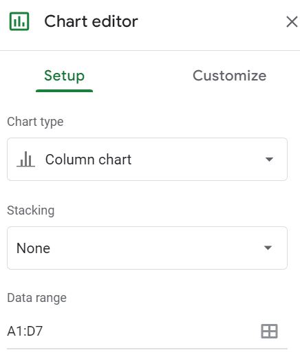
- Insert the chart first, and then open the chart editor (Double click on the chart if the editor is not already open). Under the "Setup" tab, type the range that contains your data, such as A1:D7. Press enter on the keyboard
- Or you can first select the range of cells that contains your data, such as A1:D7, and then insert the chart. When you use this method the data range for the chart will be automatically filled in with the range that was selected before inserting the chart
Horizontal vs. Vertical range combining
There is an important option in the chart editor that will allow you to "Combine ranges". Sometimes the data that you want to chart will be in columns or rows that are non-adjacent / not right next to each other, and in this case you can specify multiple ranges to combine.
The first thing that you need to do to combine ranges, is to make sure that the "Data range" field in the chart editor contains all of the desired range. Type a comma between ranges, like this A1:B7,D1:D7
The range above specifies columns A, B, and D, but essentially skips column C which as you can see in the image below… is an empty column.
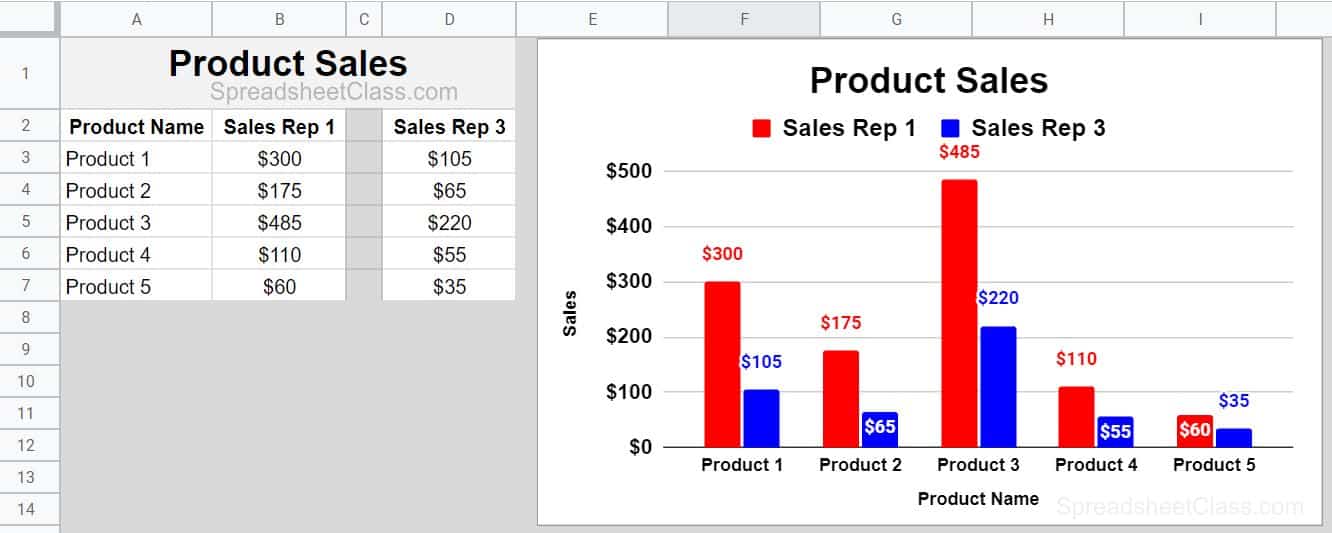
The next thing you need to do to combine ranges in a chart is to specify whether you want to combine the ranges horizontally, or vertically. In this example we want to select "Horizontally" because we are basically squeezing the separated columns together, horizontally. If you are trying to combine rows that are non-adjacent, then you would want to combine the ranges vertically.
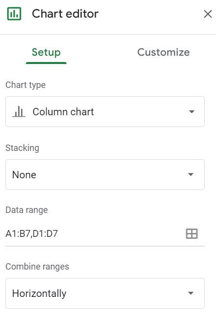
Chart multiple series with a stacked column chart (Multiple Series Required)
A stacked column chart is excellent for charting multiple series, since multiple series can be displayed with a single column, represented by different colors (As shown in the image below).
To chart multiple series with a stacked column chart, use the same methods described above for inserting the chart and connecting data to it. Except in this case you simply open the chart editor, and select the chart type "Stacked column chart" under the "Setup" tab.
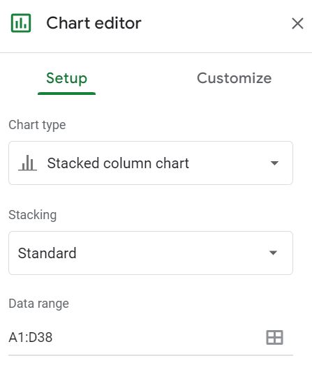
Chart multiple series with a line chart
If there are multiple lines on a line chart, then this means that there are multiple series. This is because there are multiple values / multiple series for each x-axis / y-axis value.
Use the same methods described at the top of this page to insert a chart and connect data to it, except in this case all you need to do is select "Line chart" in the chart editor, under the "Setup" tab.
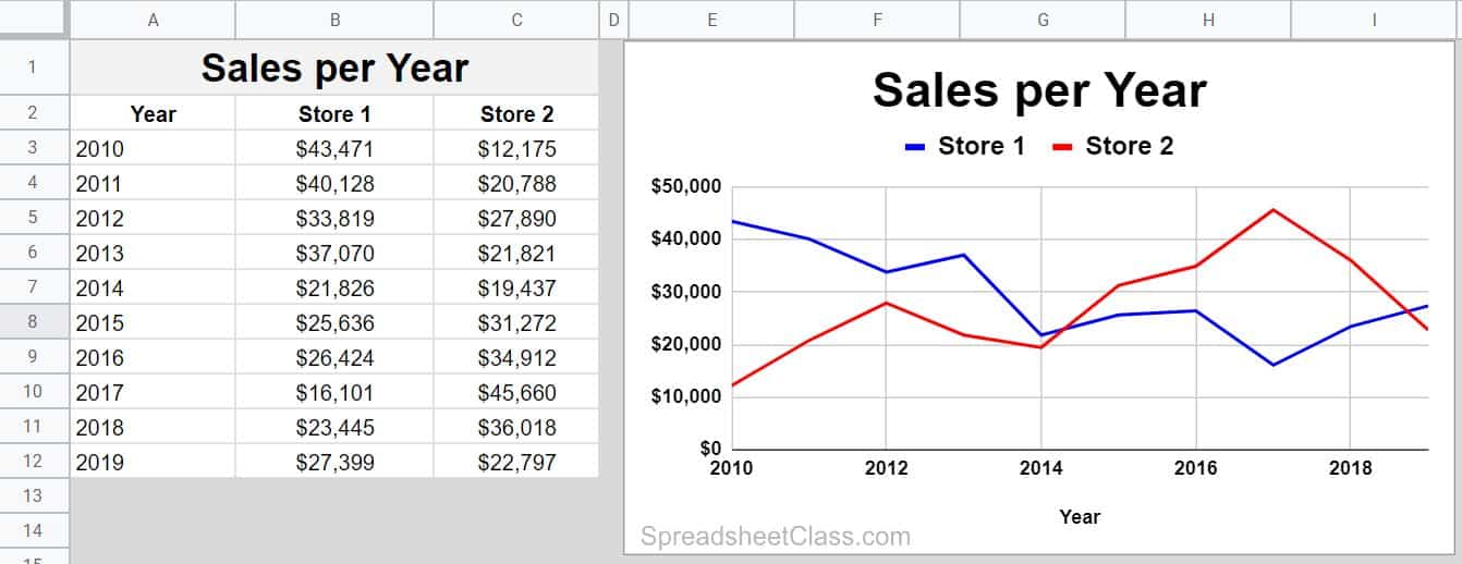
Chart multiple series with a combo chart
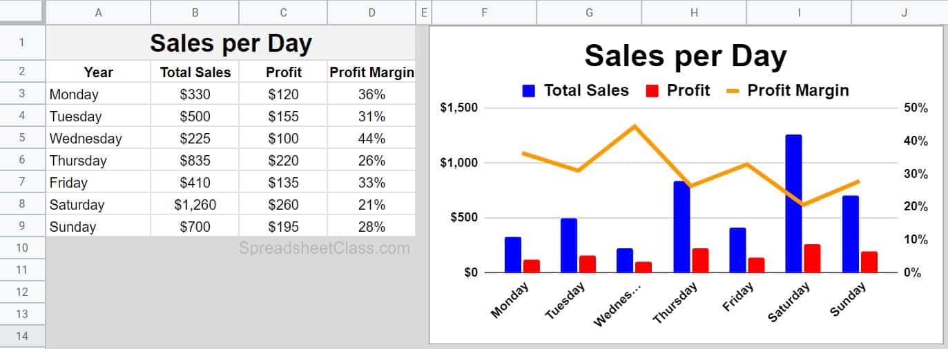
A combo chart is a special chart that allows you to chart with multiple y-axis / multiple y-axis scales. With a combo chart you can also choose whether you want your data to be charted with lines or columns, and if you want you can do a combination of the two, such as the very common chart shown below, where the revenue and profit are displayed as columns, and where the profit margin is displayed as a line. The profit margin line is on a different scale than the columns are, because the y-axis values for the line data are attached to the right axis, i.e. it has its own scale displayed on the right side of the chart.
This is done to chart data together when some of the data has very large numbers… and the other data has very small numbers…. and you want to see the relationship between the two without the smaller values showing as a little blip on the chart. So in this example the revenue and profit are expressed in dollars, on a scale from $0 to $1,500 dollars (on the left axis), and the profit margin is a percentage that range from %0 to %50, which is a very small number in comparison to 1,500… and so the profit margin data is assigned to the right axis on its own scale.
Use the same methods described at the top of this page to insert a chart and connect data to it, except in this case all you need to do is select "Combo chart" in the chart editor, under the "Setup" tab.
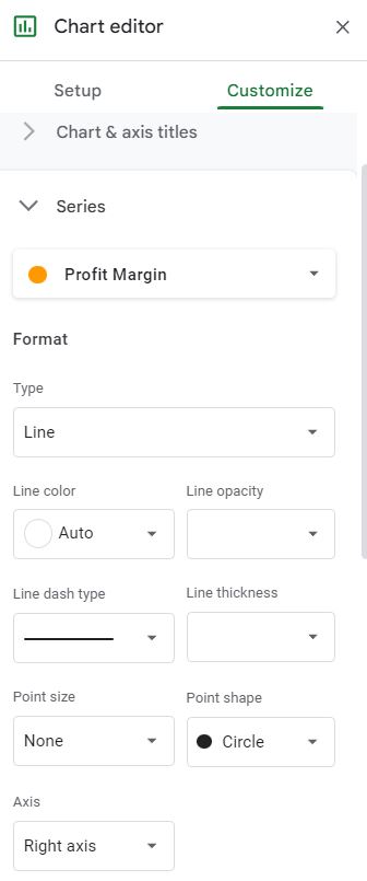
The trick with a combo chart is selecting the "Type" of the series, and assigning it to the correct axis (left vs. right). Both of these things can be done in the chart editor, on the "Customize" tab, under the "Series" menu / tab.
As you can see in the image below, for the "Profit Margin" series, the type "Line" is selected, and under the "Axis" field… "Right axis" is selected. This charts the profit margin data on its own scale which is shown on the right side of the chart (where the other data is represented as columns with a y-axis scale shown on the left side of the chart.
How to color the chart series
Selecting the correct color / unique colors for each series on your chart is important. Even if you don't have a specific color assignment in mind, making sure that the colors are different enough to easily read the chart will help a lot.
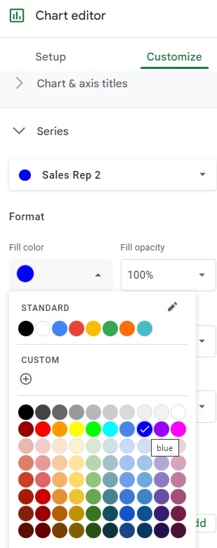
To change the color of a chart series in Google Sheets, follow these steps:
- Double click on the chart, to open the chart editor
- Click "Customize"
- Click "Series"
- Select the series that you want to change the color of
- Select the "Fill color"
- Repeat for each series if applicable
This content was originally created by Corey Bustos / SpreadsheetClass.com
How to add data labels
Data labels can be very useful for when you are charting multiple series, or even a single series. Data labels will show a value on the line / column etc. for each data point, to show the value that the line / column represents. This is especially important for a stacked column chart. An example of data labels can be viewed in the images from all of the column chart examples in this lesson.
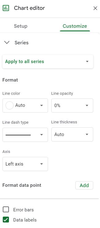
To add data labels to a chart in Google Sheets, follow these steps:
- Double click on the chart, to open the chart editor
- Click "Customize"
- Click "Series"
- Select the series that you want to add data labels to, or you can also select "Apply to all series"
- Click / check the "Data labels" checkbox
- Repeat for each series if applicable
- Optional: Format the data labels, such as making them bold or a larger font size
Now you know how to chart multiple series in Google Sheets, with multiple chart types… and you also know how to customize each series on your chart to make the chart easy to read.